在CSS3中,我们可以使用animation-direction属性来定义动画的播放方向。
语法:
animation-direction: 取值;
说明:
animation-direction属性取值有3个,如下表所示。
| 属性值 | 说明 |
|---|---|
| normal | 正方向播放(默认值) |
| reverse | 反方向播放 |
| alternate | 播放次数是奇数时,动画正方向播放;播放次数是偶数时,动画反方向播放 |
举例:
<!DOCTYPE html>
<html>
<head>
<meta charset="utf-8" />
<title></title>
<style type="text/css">
@keyframes mytranslate
{
0%{}
100%{transform:translateX(160px);}
}
#ball
{
width:40px;
height:40px;
border-radius:20px;
background-color:red;
animation-name:mytranslate;
animation-timing-function:linear;
animation-duration:2s;
animation-direction:reverse;
}
#container
{
display:inline-block;
width:200px;
border:1px solid silver;
}
</style>
</head>
<body>
<div id="container">
<div id="ball"></div>
</div>
</body>
</html>
浏览器预览效果如下图所示。
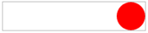
分析:
在这个例子中,由于添加了animation-direction:reverse;,因此动画会沿着反方向播放(即从100%到0%),小球从右到左移动。animation-direction属性在实际开发中用得很少,我们简单了解一下即可。
animation-name:mytranslate;
animation-duration:2s;
animation-timing-function:linear;
animation-direction:reverse;
在实际开发中,我们很少会使用动画效果的完整形式,都是采用下面这种简写形式:
animation:mytranslate 2s linear reverse;
请不要重复点赞喔
