在CSS3中,我们可以使用justify-content属性来定义弹性盒子内部子元素在“横轴”上的对齐方式。
语法:
justify-content: 取值;
说明:
justify-content属性有很多,常见的如下表所示。
| 属性值 | 说明 |
|---|---|
| flex-start | 所有子元素在左边(默认值) |
| center | 所有子元素在中间 |
| flex-end | 所有子元素在右边 |
| space-between | 所有子元素平均分布 |
| space-around | 所有子元素平均分布,但两边留有一定间距 |
举例:
<!DOCTYPE html>
<html>
<head>
<meta charset="utf-8">
<title></title>
<style type="text/css">
/*定义整体样式*/
.flex
{
display: flex;
flex-flow: row nowrap;
background-color:lightskyblue;
margin-bottom:5px;
}
.item
{
width: 80px;
padding:10px;
text-align: center;
background-color:hotpink;
box-sizing: border-box;
}
/*定义justify-content*/
.start{justify-content: flex-start;}
.center {justify-content: center;}
.end {justify-content: flex-end;}
.between {justify-content: space-between;}
.around {justify-content: space-around;}
</style>
</head>
<body>
<h3>1、flex-start:</h3>
<div class="flex start">
<div class="item">1</div>
<div class="item">2</div>
<div class="item">3</div>
<div class="item">4</div>
</div>
<h3>2、center:</h3>
<div class="flex center">
<div class="item">1</div>
<div class="item">2</div>
<div class="item">3</div>
<div class="item">4</div>
</div>
<h3>3、flex-end:</h3>
<div class="flex end">
<div class="item">1</div>
<div class="item">2</div>
<div class="item">3</div>
<div class="item">4</div>
</div>
<h3>4、space-between:</h3>
<div class="flex between">
<div class="item">1</div>
<div class="item">2</div>
<div class="item">3</div>
<div class="item">4</div>
</div>
<h3>5、space-around:</h3>
<div class="flex around">
<div class="item">1</div>
<div class="item">2</div>
<div class="item">3</div>
<div class="item">4</div>
</div>
</body>
</html>
浏览器预览效果如下图所示。
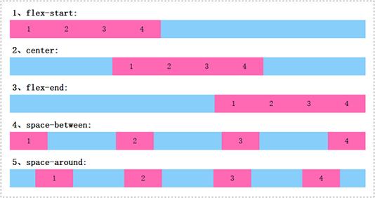
分析:
在上面的例子中,父元素的宽度大于所有子元素的宽度之和。从预览效果中,我们可以很直观地看出justify-content属性取不同值的时候,弹性盒子内部子元素在水平方向上是怎么对齐的。
